
Animations: Now on Mobile & Tablet
Don Fidler • 9 November 2020
Create dynamic, attention-grabbing experiences on all versions of your site with animations on mobile & tablet. Draw attention where you want it to go with bouncing buttons, zooming images, columns that fade in and more.
Getting Started With Your New Mobile Animations
You’ve got the same great Entrance Animations on mobile and tablet that you've had until now on desktop. Use them to help site visitors focus as they browse your site, so they know where to look and what to do.
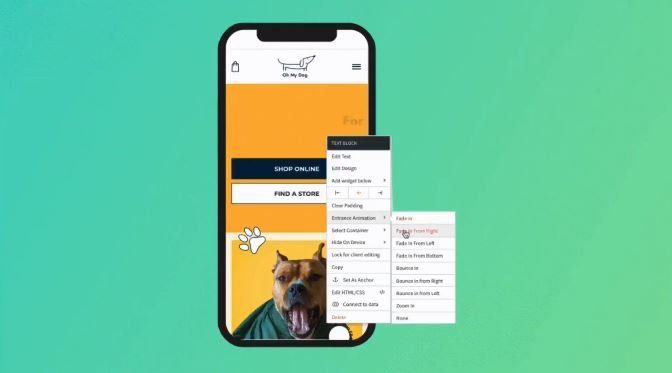
To add animations to mobile or tablet site versions click the context menu of the element you want to animate on the relevant device and click Entrance Animation. You’ll find eight animations to choose from.
Note:
Animations are separated between desktop, mobile and tablet.
Mobile Animations - Best Practices
Animations are a great way of drawing visitors’ attention to specific elements on your sites and encouraging them to take the actions you want them to. You can also use them to solve problems - for example, encourage visitors to scroll down with an animated downwards arrow.
As on desktop, animations on mobile should be added thoughtfully, so keep the following best practices in mind:
- Mobile & desktop are different. Mobile sites tend to be more playful, so the animations you choose for them can reflect this. For example, what looks right as a fade in animation on desktop may look better as a bounce on mobile.
- Use animations in moderation. Too many animations can distract and confuse visitors, so choose where you add them wisely.
- Think about site hierarchy. Animate elements that are more important rather than those that are less important. For example, it may be more important to animate a Shop Now button than it is to animate a Read more link.
- Choose the right type of animation. Not all animations are created equal. Bounce is fairly aggressive; fade is much more subtle. Choose the animation according to the element you’re animating and the site’s look and feel.
To get started with mobile animations, open any site, click the mobile view, and start adding animations!


